Frequently Asked Questions
Essential insights into establishing stable visual boundaries, resilient typography systems, and reproducible cutter pathways across variant collections.
Comprehensive specifications for sustaining structural integrity across variant runs, constrained boundary boxes, and typographic scales.
When configuring multi-sku product systems, varying ingredient lists or nomenclature lengths often break adjacent artwork. A fixed outer perimeter locks down container coordinates, establishing rigid exclusion zones for all modular sub-elements.
By establishing immutable envelope boundaries, designers ensure that title expansion never collides with regulatory disclosures, barcode margins, or visual iconography.
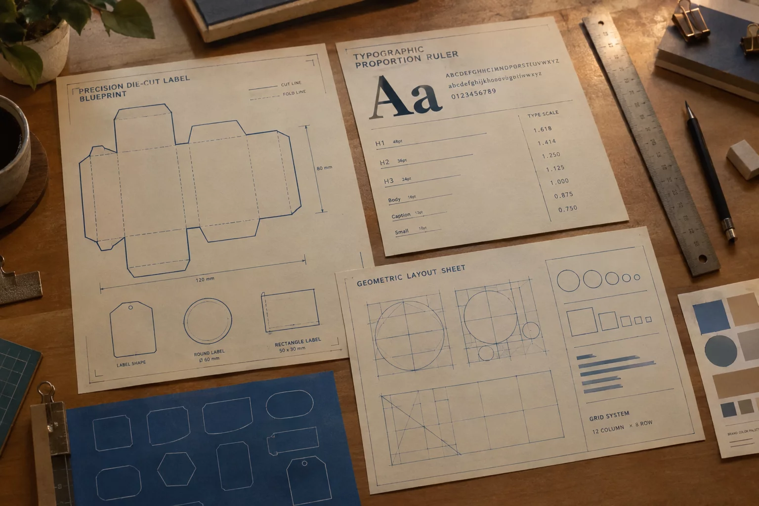
Rather than dynamically squeezing glyphs horizontally (which warps stroke contrasts), systematic type scaling relies on tiered point size increments and pre-calculated line breaks.
We establish strict character cutoffs: short names (under 14 characters) display at primary display size, while extended names automatically step down to a secondary preset tier without changing letter proportions.
In Silhouette Studio, cut lines must reside on a dedicated registration layer separate from vector artwork fills. Repeated label silhouettes should always inherit shared registration marks with a mandatory 1.5mm bleed buffer.
Keeping geometry consistent across variations ensures knife depth and blade friction remain stable throughout uninterrupted cutting passes.
Repeated silhouettes maintain brand recognition on retail shelving while substantially cutting tooling overhead. When individual product releases share an identical die-cut profile, container packaging stays unified.
Variant distinction is achieved through internal typographic structure, tint variations, and standardized iconography rather than erratic boundary profiles.
Type hierarchy relies on deliberate weight contrasts, proportional line-heights, and spatial barriers. Regulatory copy must meet minimum legal height requirements while strictly adhering to a subdued contrast ratio.
This discipline keeps consumer attention centered on variant categorization while keeping secondary disclosures fully legible upon close inspection.
Color consistency across separate production intervals demands calibrated densitometer readings and fixed ICC print targets. Digital master files must lock Pantone matching references directly within vector spot channels.
Mechanical registration tolerances should not exceed 0.3mm across adjacent plate runs to eliminate misaligned border lines or hazy typographic edges.
No specifications match the specified query or category criteria.
Submit your exact layout parameters, material constraints, and cutter specifications to our field desk for structural evaluation.