Boundary Collisions in Variable Character Strings
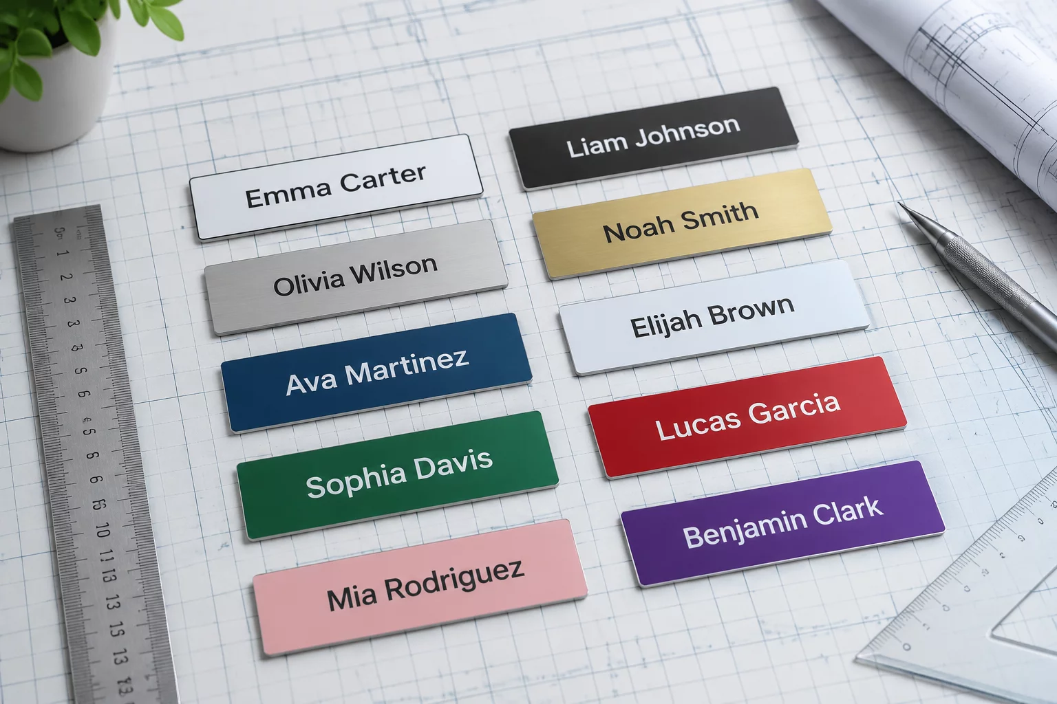
Personalization batches frequently introduce outlier names that exceed twenty characters. While names like Leo or Mia leave generous breathing margins, names such as Christopher-Alexander or Bartholomew-Vance push the limits of preset boundaries. When these extended strings enter a uniform label template, the immediate instinct of many operators is to grab the horizontal transform handle and crush the word horizontally. That decision immediately destroys font proportions, distorts vertical stroke contrasts, and turns the label into an amateurish sticker.
A systematic layout approach treats the label border as an unyielding architectural wall. In high-speed die-cut manufacturing, blades fluctuate by up to 0.75 mm across repeated sheets. Placing text too close to the perimeter invites edge trimming errors. Protecting that perimeter requires strict rules for hyphenation breaks, font family substitutions within the same typeface superfamily, and calibrated font point reduction.
Structural Techniques for Managing Outlier Glyphs
Handling extreme string lengths without sacrificing aesthetic cohesion requires predictable parameters. The following four mechanical guardrails guarantee that longest-in-set variants look deliberate rather than retrofitted in desperation:
-
1
Superfamily Condensed Transitions Switch to a designed condensed cut of the exact same font family rather than applying non-proportional horizontal scaling in software.
-
2
Syllabic Stack Partitioning Divide compound or hyphenated surnames across two stacked lines, keeping leading locked to 110% of font size for compact baseline balance.
-
3
Strict Negative Tracking Ceilings Restrict letter-spacing reduction to a maximum of negative twenty units to prevent touching serifs and ink bridging during print runs.
-
4
Non-Negotiable Safe Zones Maintain an absolute inner safety barrier of at least 3.2 mm between the outermost glyph edge and the finished cut perimeter.
Applying these four guardrails consistently transforms what would otherwise be a chaotic layout puzzle into a reliable, repeatable printing procedure.
Balancing Visual Weight Alongside Short Counterparts
Label series rarely exist as isolated items. When an end user inspects a complete tray of thirty spice jars, pantry bins, or sample vials, the extreme variant sits directly next to single-syllable entries. If you scale down an outlier name to a minuscule 5-point size, it reads as a gray blur next to bold, generous titles.
A label variant never lives in isolation; if the longest name looks like an unreadable smudge, the entire batch loses typographic authority.
Marcus Vance, Layout Systems LeadEstablish a hard point size floor across the whole collection. In commercial vinyl and offset printing, 7 points is usually the absolute functional minimum for display titles. If an extreme string cannot comfortably clear the safe perimeter at that size, you must split it across two vertical tiers. Preserving line weight preserves brand authority across the entire packaging run.