The Paradox of Abbreviated Text Strings
Compact names like Mia, Alex, Bo, or Eve present an unexpected challenge in variable label manufacturing. Production designers instinctively worry about long names bursting beyond cut contours, yet short strings create an opposite defect: cavernous negative margins that make identical die-cut substrates appear empty or unfinished.
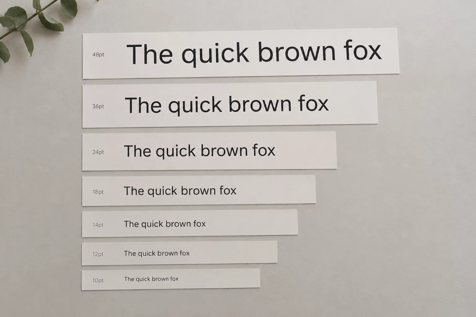
Scaling font size upward to consume that vacant area immediately shatters series cohesion. A three-letter name enlarged to 36 points next to a fourteen-letter counterpart at 14 points causes the short variant to dominate the batch with disproportionate stroke thickness and overpowering presence. True consistency relies on controlled tracking, disciplined point ceilings, and calculated white space distribution rather than brute-force font enlargement.
Four Compensation Rules for Compact Names
When engineering repeatable template files in software environments like Silhouette Studio or vector illustration tools, calibrate parameters against this four-step threshold matrix:
-
1
Strict Cap on Point Size: Restrict maximum font size growth to 115% of the series median, preventing short names from yielding exaggerated stem weights.
-
2
Conservative Letterspacing Expansion: Increase character tracking by no more than +15 to +25 thousandths of an em to widen the visual footprint without breaking word cohesion.
-
3
Locking the Vertical Baseline: Anchor the text baseline to a constant coordinate so variable names share horizontal alignment regardless of ascender counts.
-
4
Secondary Ornamentation Anchor: Introduce non-scaling secondary elements such as subtle border rules, dates, or subtitles to maintain balanced container occupancy.
Applying these boundaries ensures that three-letter names maintain dignity and clarity while coexisting seamlessly alongside seven-letter and eleven-letter companions across the identical sheet layout.
Balancing Sheet Rhythm and Cut Uniformity
During physical label finishing, die registration fluctuates within typical hardware tolerances between 0.25mm and 0.75mm. A short name pushed excessively wide or tall magnifies blade wander, making slight cuts appear visibly lopsided against surrounding borders.
“True typographic balance across variable label runs is achieved not by filling empty space, but by teaching white margins to perform the same structural work as inked strokes.”
Arthur Pendelton, Production TypographerRespect safe inner bleed margins strictly. By holding short glyph sets inside an inner boundary of 4.5mm from all vector cut paths, you safeguard the physical decal from cut drift while preserving uniform optical rhythm across finished products.