Type Scaling
Proportional Font Scaling
Mathematical ratios, cap-height thresholds, and optical bounding boxes that prevent erratic glyph distortion across variable-length name sets.
Mathematical ratios, cap-height thresholds, and optical bounding boxes that prevent erratic glyph distortion across variable-length name sets.
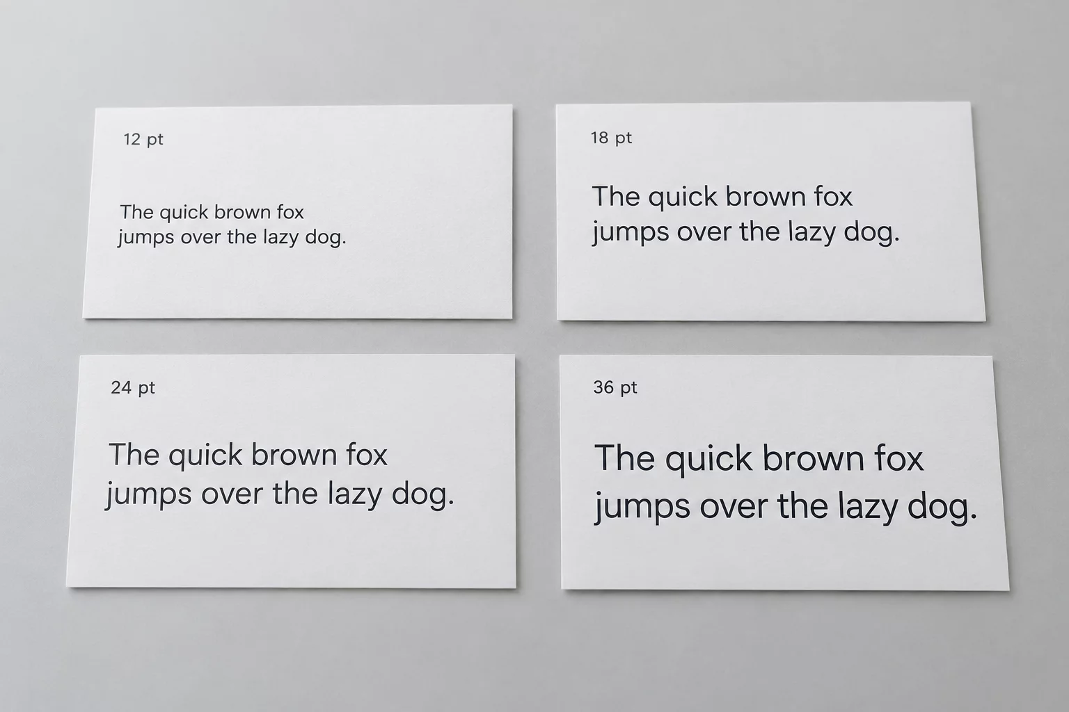
Variable name labeling on uniform die-cut silhouettes exposes the immediate vulnerability of automated layout software: non-proportional stretching. When a production template blindly squishes "Christopher" to occupy the identical footprint as "Mia", the letterforms suffer severe horizontal compression, distorted stroke weights, and ruined geometric balance. True proportional scaling preserves the innate design geometry of the typeface by reducing point size universally along both X and Y axes simultaneously.
Instead of squeezing glyphs horizontally, professional variable workflow establishes strict boundary margins and allows the horizontal text span to breathe. A four-letter name like "Alex" naturally occupies less lateral distance than a nine-letter entry, but both retain consistent cap-height relationships and identical stem-weight perception. When names exceed the standard bounding envelope, reduction must occur in controlled increments of 0.5 points down to a pre-calculated legible floor.
Maintaining family coherence across seventy distinct name labels sharing a 50×30 mm die-cut boundary requires three non-negotiable geometric constraints:
Key design safeguards to ensure variable production sheets maintain structural elegance without manual rework on every individual name tag.
In high-throughput printing and cutting setups, human observers inspect sheets in aggregate rather than evaluating tags in isolation. A single over-compressed or microscopically reduced label breaks the visual rhythm of the entire production sheet. By pre-defining stepped size buckets—such as 18 pt for 3–5 characters, 16 pt for 6–8 characters, and 14 pt for 9+ characters—craftspeople eliminate visual dissonance and guarantee seamless batch harmony.
When vector cutters trace around tight boundaries, consistent glyph sizing ensures blade paths maintain safe clearance from physical label edges. Proportional font scaling is not merely an aesthetic choice; it directly safeguards cutting accuracy, weedability, and structural longevity across all adhesive materials.

Consult our complete library of geometric specifications, blade offset tables, and nesting blueprints for variable label sets.