Variant Sets
Five Names, One Label Shape
Managing varying character counts within a uniform label outline demands disciplined horizontal tracking, fixed baseline anchors, and deliberate visual weight.
Managing varying character counts within a uniform label outline demands disciplined horizontal tracking, fixed baseline anchors, and deliberate visual weight.
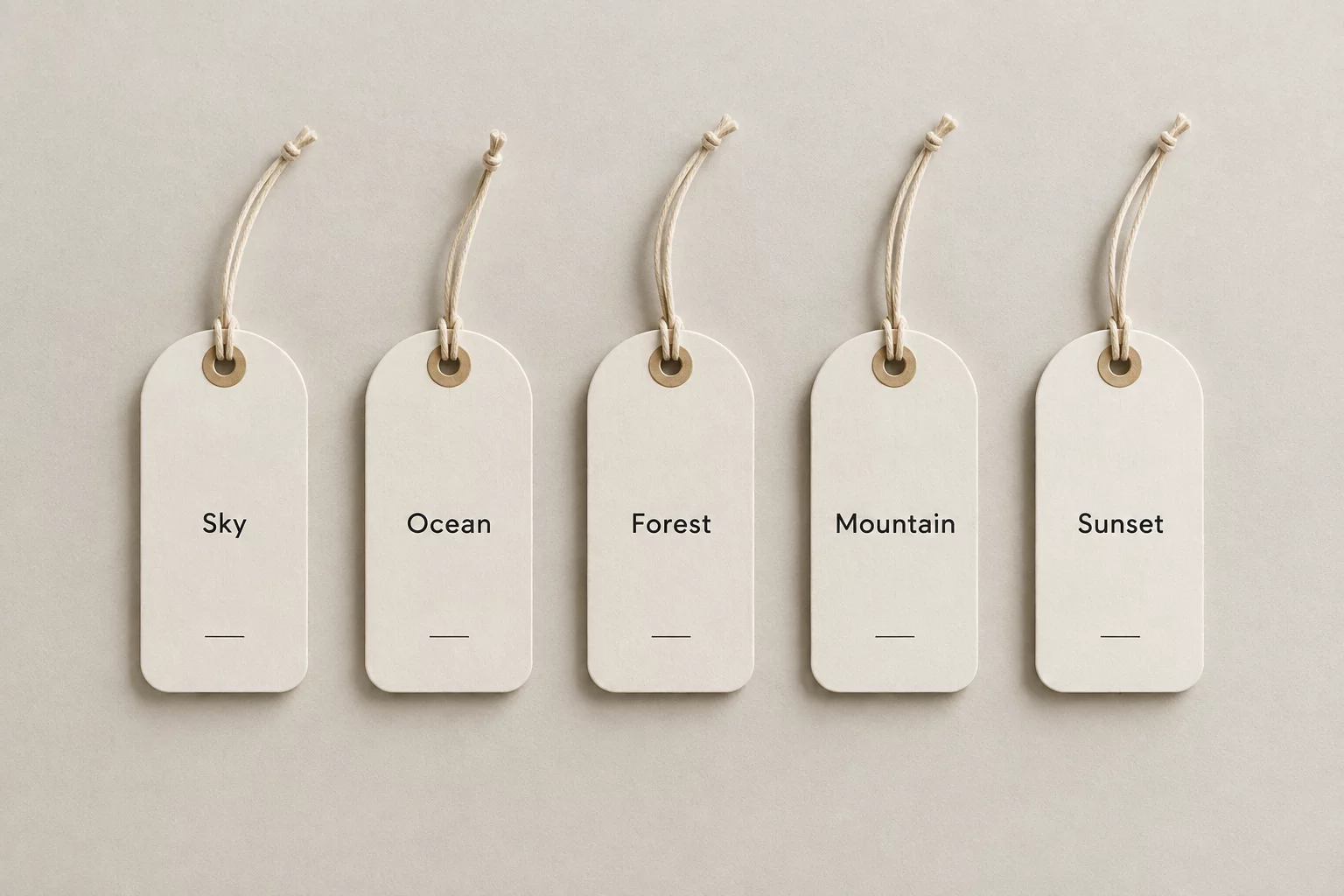
When a production run requires five completely distinct names on the exact same die-cut label geometry, designers face an immediate dilemma: an identical label contour must house short two-letter names alongside sprawling eleven-character compounds without appearing either empty or congested.
In this case study, we evaluate Mia (3 characters), Christopher (11 characters), Alex (4 characters), Samantha (8 characters), and Jo (2 characters) placed inside a uniform rounded rectangle. Rather than reshaping the cutline or randomly shrinking letters, maintaining visual harmony depends on setting immutable boundary constraints, fixing vertical baselines, and adjusting tracking and scale within strictly calibrated tolerances.
Direct horizontal centering often fails when variable names contain uneven ascenders or disparate letter widths. For Christopher, the expansive eleven glyphs press dangerously close to outer edges, while Jo risks floating aimlessly in vacant negative space. Solving this disparity requires establishing an internal safe bounding box that guarantees minimum edge clearance while defining an optical baseline anchor.
Visual unity across variant sets is achieved not by making all letters the exact same physical size, but by ensuring every name carries equivalent visual gravity within the contour.
To equalize visual gravity across the five names, we calibrate character spacing rather than relying on extreme point-size reductions. Christopher is set at an optical 14-point scale with slightly condensed tracking (-15‰), preventing crowded stems. In contrast, Jo and Mia leverage a slightly wider 17-point scale accompanied by generous tracking (+25‰) and subtle supporting metadata, anchoring the text block firmly against the label baseline.
During batch nested layouts, registration shifts of even 0.5 mm can distort perception if text margins run too tight. By testing Christopher against our calibrated safe perimeter, the outer margin absorbs small mechanical shifts during die cutting without clipping visual weight. The identical bounding box applied across all five names ensures that whether the cutter encounters Alex or Samantha, the perceived margin remains stable.
When exporting vector cutlines to digital cutting plotters, separate the text artwork onto an isolated registration layer while keeping the master die-cut shape identical across all five artboards. This maintains rapid gang-run printing and nesting while preserving the geometric integrity of the finished batch.
Receive technical layout guides, baseline coordinate charts, and nesting rules for variable name sets.