Build Label Series That Still Look Like One Family
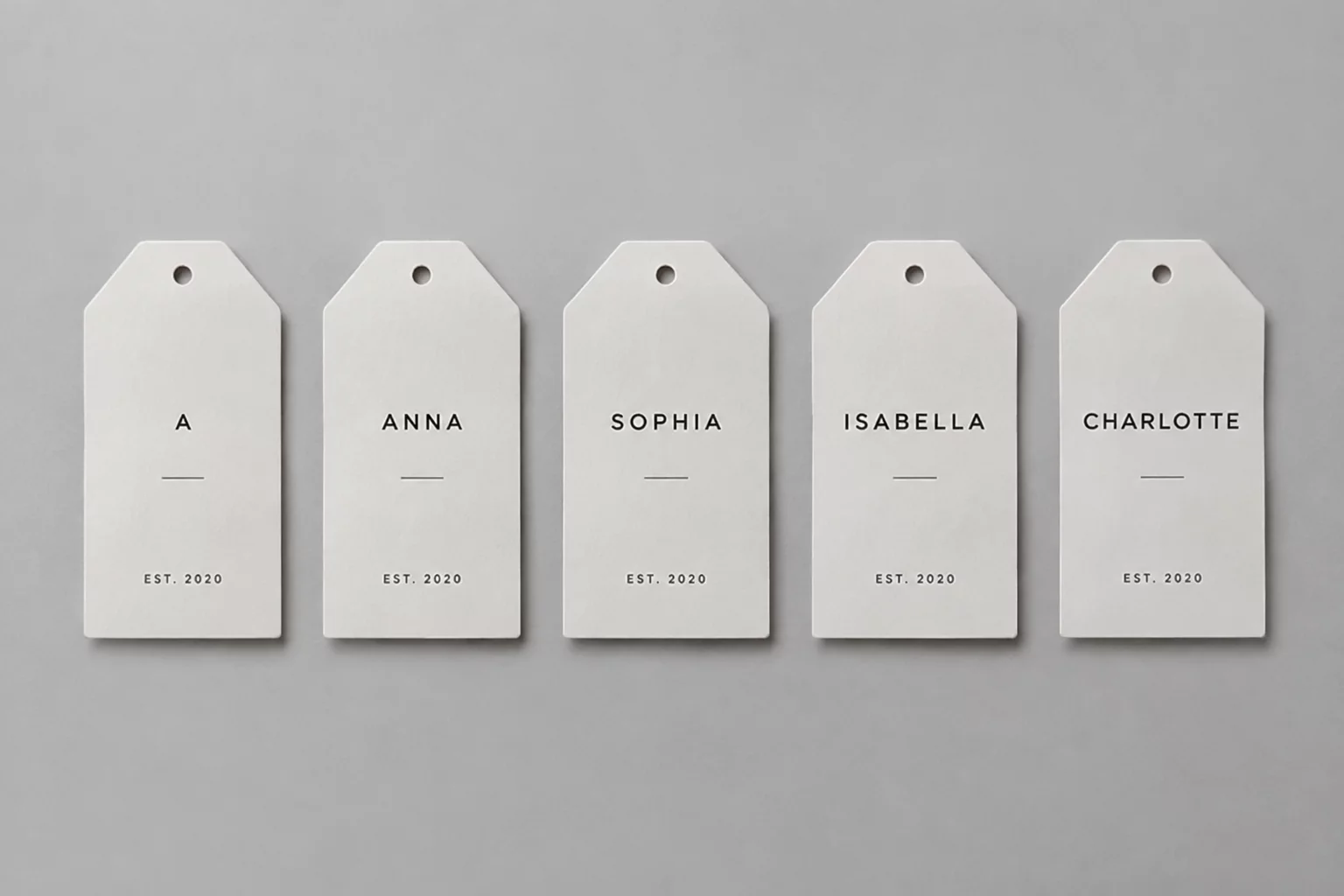
Compare name lengths, text hierarchy, repeated shapes, spacing, and cut boundaries across label variants.
Calibrated scale test demonstrating structural stability from short two-letter names through hyphenated family markers.
This fieldbook is about building related label variants—not arranging parts to save material. Each series moves through the same consistency workflow.
Rigorous benchmarks gathered across multi-tier variant production sheets, vector die-cuts, and variable text sets.
Continuous field validation across evolving desktop cutters and industrial finishing runs.
Printmakers, packaging technicians, and studio teams utilizing uniform shape systems.
Production runs fabricated without single-variant boundary collisions or offset drift.
Observed kerning baseline and margin threshold variance across dense nested layouts.
Unchecked variance across names, boundaries, and baseline grids turns repeated cut sheets into costly print reruns. Discover the technical friction points in variant workflows.
Relying on automatic kerning across 3-letter to 18-letter names distorts visual stroke weight, causing compact labels to feel choked while elongated variants appear sparse.
Modifying external label boundaries independently per variant breaks alignment sheets in Silhouette Studio and generates jagged contour cuts on batch peelers.
Fixing vertical coordinates without accounting for descenders in long compound surnames pushes low accents and commas past die bleeds.
Manually shrinking font point sizes by eye per single sticker ruins stroke weight uniformity across the complete product family set.
Pinpoint your immediate label production bottleneck below to instantly filter relevant typographic tolerances, batch rules, and layer workflows.
Standardized procedures for keeping letter spacing legible without distorting uniform label baselines across names.
Quality evaluation methods ensuring unified optical weight and stroke harmony across multi-name series sheets.
Step-by-step vector path assignment and cut boundary isolation for flawless multi-variant plot runs.
No guidelines match this selected filter at this moment.
Compare manual copy-paste iteration against a disciplined, constraint-based architecture for multi-name label sheets and die-cut consistency.
| Production Aspect | Manual Duplication |
RecommendedVariantLabel Method
|
|---|---|---|
|
Name Length Variations
Managing short vs. long name strings
|
Arbitrary manual resizing; distorted letter proportions and broken vertical baselines.
|
Proportional step-scaling with strict character limits and baseline locks.
|
|
Die-Cut Boundary Safety
Preserving protective offsets to cutter edges
|
Text layers drift close to cut lines; frequent edge clipping during blade drift.
|
Fixed internal safe margins locked to vector boundary vectors across all items.
|
|
Corner Radius Uniformity
Preserving uniform silhouette contour radii
|
Accidental point dragging alters corner radii between repeated stickers.
|
Parametric master shapes with immutable outer paths and linked nested contents.
|
|
Tracking & Kerning Limits
Optical text density across variant sets
|
Extreme letter squishing or stretching without minimum spacing guidelines.
|
Predetermined tracking ranges preventing typographic distortion on long strings.
|
|
Sheet Grid & Nesting
Layout alignment across multi-label batches
|
Irregular spacing and manual nudging causing blade trajectory collisions.
|
Rigid matrix array coordinates with uniform gutters and cutter registration marks.
|
|
Batch Quality Audit
Pre-flight check of all variations
|
Visual spot-checking after printing; frequent reprint scrap due to overflow.
|
Systematic cross-variant inspection checklist before outputting to plotter.
|
An empirical layout study verifying how five starkly contrasting character counts—Mia, Christopher, Alex, Samantha, and Jo—retain shared optical weight and brand cohesion within an identical die-cut silhouette.
When die-cut tools cannot be interchanged between runs, typographical calibration must absorb variations ranging from two glyphs up to eleven glyphs without distorting baseline rhythm or margin tolerances.
Preserves outer edge spacing to eliminate cutter drift and print-head registration overlap.
Increases glyph breathing space for short strings while contracting kerning for multi-syllable runs.
Ensures containers lined up on retail shelves project an uninterrupted visual rhythm.